Thursday 17 March 2011

Products

Here is the products for my music magazine:

Front Cover:


Contents Page:


Double Page Spread:

Friday 10 December 2010

Research & Planning

I plan to call the magazine The Wall as this is also the name of a famous magazine and with a simple name like this it can't be copyrighted as just the album. I also would like to have the name of the featured artist as

This is the research and planning I have been producing for this work. These are the concept designs I created for the front cover of the magazine:

I think that I will settle for this one.


 The next set of images are concepts plans for the contents page:

I think I will use this design over the other.
The next is concept designs for the double page spread:


I am going to use this one for the double page spread.

Last of all is the mind maps made for ideas on all of the pages:

Wednesday 24 November 2010

LIIAR Analysis Of Three Double Page Spreads

The first I wish to analyse is a double page spread from the magazine Kerrang.

This double page spread uses such media language structures as a masthead, a main image, a series of four other images and a sidebar containing various information along with a bar stating which section this part of the magazine is such as this double page spread shows the bar displaying "news world exclusive".

This double page spread also shows that the institution involved is the magazine Kerrang I know this because there is a sell line on this page suggesting that the band My Chemical Romance had invited Kerrang to their recording studio. I think that it's hardly likely to be advertising an event which there competitors are doing at the time because that would sell the other magazine. This magazine is using the band My Chemical Romance to sell there own magazine which at the same time are selling the band which they are featuring. This idea of two areas of the media helping each other out on a regular basis happens quite often.

This magazine double page spread uses various bits of ideology one being how such as how the various images are showing the band My Chemical Romance showing as much effort as possible through each of the images shown. Making it look like they are both trying there hardest and at the same time enjoying playing/writing the music they play.

The target audience for this double page spread and music magazine in general is the indie and modern rock music genre. I think this due to the kind of band being hosted on the double page spread along with the colour scheme being used which is deprived of red, black and white. These colours are often seen as the colours used by typical rock bands.

This double page spread represents the bands as being a successful band due to how hard they try at there work. This could be a way of trying to get people who wish to be like these people that there is more than just fun and games to having a job and lifestyle like this.

The next magazine double page spread I wish to analyse is a double page spread from Q magazine.

This double page spread uses such media language techniques as a masthead stating the topic in this case it says "CASH for questions" suggesting that this is a interview of Paul Weller. This cover uses a simple image on one side and the text/other content on the other.

The double page spreads institution is Q magazine however featured in this double page spread is Paul Weller who could be classed as a institution as he or people related  to him in terms of business will benefit from him being in a magazine. This could help sell any products based around him or his associates.

This magazine double page spread uses such ideas as within the image there is a flag being the Union Jack. This suggests that he is from or strongly supports the United Kingdom.

This magazine aims this spread at the audience who grow up in the 70's - 80's as the bands he is from are The Style Council and The Jam from each time period this means that the population who would grow up with his music would be people around 40's and up in there age.

The spread represents Paul Weller in my opinion as a man who now is quite low on money as the title of the page is cash for questions. This does not give a very good impression of this man for the readers however this may encourage the readers to buy or use his less recent products such as music he has produced in the past with his older bands when he had the spare money.

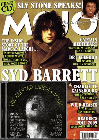
The next double page spread I will be analysing will be a double page spread from a Mojo magazine.

This double page spread uses such media language features as a masthead lots of various images and is split up into different sections by a divider rather than using the page to do so. This is different to the other magazines that I have looked at previously before. The pages also contain a large amount of text split up again but this time by spaces rather than a line divide.

This double page spreads institution is the music magazine Mojo. However the magazine also enforces other institutions especially on this particular double page spread where multiple products from other institutes is featured. This will benefit those on this page by producing a form of advertising.

This spread uses ideology methods such as how it presents the bands and music in each of the images, now a lot of these will most likely be just album covers but the image on the left page is showing a group of man in black and white and in various clothing this black and white image could be implying that there music type is styled to music which is from the past or they are from the past by which I mean that this could be an image taken in the past.

The audience of this spread could be based around different age groups as it is selling different products.

This double page spread represents this featured music as something which people should buy. I find this because the title for this double page spread is "How To Buy" suggesting that readers should spend there money like suggested in this magazine.

Wednesday 17 November 2010

LIIAR Analyisis Of Three Contents Pages


The first music magazine contents page which I will be analysing is a NME magazine contents page from the January the 17th  2009. This magazine contents page uses various conventions of a typical music magazine contents page.


This magazine contents page uses such language styles as having a series of images situated in the center of the page displaying other pages of the magazine which appear to be interviews of various bands. With the tag line of "everything you need to hear this year" this uses a rhyming technique to make the tag line more catchy as well as suggesting that the bands reviewed within this music magazine are the only albums/bands which you need to listen to. This magazine also uses another masthead which also contains the name of the magazine NME. This magazine cover also contains a typical advertisement intended for the reader to subscribe to the magazine allowing for the reader to pay a fixed sum of money for a future series of there magazines delivered to there front door. This magazine features various tabs filled with information about the content of the magazine such as reviews, news and a band index for all of the bands referenced within the magazine.


This contents page does not show any information about it's institution other than the masthead containing the name of the magazine. This magazine contents page contains various areas of ideology such as the mentioned earlier about the tag line for the images within the contents. This tag line "everything you need to hear this year" is suggesting that they, the music magazine NME have everything which you need to hear this year. This is quite a assumption suggesting that this is the only music you wish to listen to.

The audience that this music magazine is possibly aimed at is the a young population who likes such bands and music styles as indie and similar music styles. This magazine represents the population who read and buy this magazine to be lively and active wanting to go to as many gigs or concerts as possible for them. I think this because there is an entire section devoted to this cause amongst one f the pages.

The second music magazine contents page which I am going to perform an analysis on is one of the Q magazines from October in 2008.

This magazine uses various conventions and elements for it's contents page. Such as the contents page uses such things as a masthead displaying the name of the magazine and the name of the page being the contents page. This page also has a series of lists and references to the other pages along with a large central image which appears to be quite a consistent convention of a contents page. There is two images on this contents page one main one and one placed along with a review section. This could be used to imply what the review is about before the reader or consumer begins to start reading about the contents of the review.

This magazine uses institutions such as the name of the magazine based upon the top of the contents page. There is also the name of the band which is displayed in the magazine contents page "The Courteeners" this is used to advertise and essentially sell the band whilst at the same time the band within the magazine is also selling the magazine as some consumers may wish to read about such bands thus buying the appropriate magazine.

This magazine uses ideology such as the idea of representing "The Courteeners" as a group of ordinary people which essentially is what they are. They do this by adding a comment saying, "He's just showing off". This implies that the band have there woes and not so good factors keeping them from being perfect and different people.

This magazine suggests that the audience for this magazine is young to middle aged people as this magazine has also had people such as the rich and powerful ex-member of the Beatles Paul McCartney. This man is one of the few members of the band still loved by many who have lived the test of time and the hardship of a powerful life.

This magazine represents the band "The Courteeners" as a young aspiring band who wish to flourish into a much more powerful band than they currently are.

The next music magazine contents page which I will cover is a Mojo magazine contents page.


The contents page uses various language techniques such as it contains lots of images. Three of these are images of the staff working on the magazine and other images related to the content of the magazine. 

The magazine's institutions such as the publisher is Bauer Media and the creators of the magazine are Mojo. They use other peoples institutions for there own devices such as for producing articles about different bands and people.


The magazine uses such ideology as in one of the images there is the words "Mojo Men" this could suggest that the readers may consider themselves men from reading this magazine.


The magazine's target audience appears to the middle a young adult age groups as this contents page contains various elements such as two of the images are cartoons suggesting a younger viewing audience.


This magazine contents page represents

Tuesday 16 November 2010

LIIAR Analysis of three music magazine covers


The first cover that I will be analysing at is, "Classic Rock Magazine". This magazine uses varying different language ideas such as the large image of the famous hard rock band AC/DC along with the name AC/DC for the sell line. I think that this magazine uses this band on it's front cover because they wish to attract the fans of this band to read this magazine and due to the popularity of the band upon the classic rock community will potentially bring a lot of people to read it. The cover also contains other elements such as a bar code, a series of sell lines, a date line and other features.

The institution of this magazine is the classic rock magazine along with the future publishing. This magazine appears to be aimed at the middle aged group of people as these people would have been around to experience such music. However this is not to say that a younger or older population of people cannot read this magazine.

I find that the ideology behind this magazine is to increase the amount of people who want to buy this magazine because of the free CD which is being provided with the magazine. I feel that it this is a attempt to try and sell the magazine to sell more than it currently is, or maybe to gain a competitive edge of other music magazines covering this particular genre. I find that this magazine wishes to convey the idea of classic music being the pinnacle of the music industry. That AC/DC is one of the best bands in this particular music genre.

I think that the audience for this music magazine is typically the middle aged group as this is typically the music of which this age group would listen to however there is some younger aged people who may listen to such music as so do I.

I find that this music magazine represents the bands such as AC/DC, Van Halen ect. as the typical rock stars which are recognised as the in modern society which we live in. I think this because of the way that by the magazine cover saying "Angus and Bon get lippy in 77" which is implying that these to people have been singing however by saying that the two people Angus and Bon are getting lippy is suggesting to me that the two are given a more rebellious and stereotyped persona by this magazine.

The next music magazine cover I wish to look at is the Q magazine cover celebrating John Lennon's 70th birthday. This magazine cover appears to be a special edition version of the standard magazine covers as it is covered in a gold trim. 

This magazine uses the usual media language conventions for a magazine such as a masthead, a sell line, cover lines, a bar-code and various images mainly  the main image covering the most of the magazine. This image has around it the rest of the features and general content avoiding the actual image and using up the spare white space rather than the cover it self.

This magazines institution is based around Q magazine has it is very clearly shown in a large image in the top corner of the page in contrasting colours red and white. This magazine is published by Bauer Media Group. 

This magazine uses ideology such as how the magazine has paired John with Yoko on the image rather than just having an image of him on his own. This could imply that John was heavily influenced by Yoko when he was writing his music. This magazine is using the power which John Lennon has as a idol and being once a former member of The Beetles this gives the magazine something to use as a way of advertising there magazine to the public as it contains information and other things such as pictures interviews and story's about this famous man in all of his glory.


This magazine cover addresses a audience of which people who recognise John Lennon as a former member of The Beetles. The population tends to be ageing from around 20 to 65 years old. As this is the generation who got to witness the band in full swing.


The magazine represents John Lennon as a idol and a great man who was a great musician. 

The last magazine front page I will be analysing is Mojo Magazine made in March 2010. 


This magazine cover is quite packed as it contains a large sell line across the page along with the six other cover lines along with a brief description for each of the items. The main image is a large picture of Syd Barrett across the page in-front of the mast head "Mojo". The magazine cover also contains other conventional aspects of a front cover such as a bar-code, a puff about a free CD with the magazine. The magazine has quite a yellow aged style tint to the background, this could suggest that the person in the image is very old or unfortunately dead.


The magazine is made by Mojo which is published by Bauer Media which is a large and quite powerful media company. The magazine has quite a simple and straight forward white logo.

The ideology of this magazine cover seems to me to be trying to get an idea across about the different bands and people who have been around in the past. With the colour of the images background however this background colour could also be considered as a gold colour suggesting that this generation of people where born in the golden age the pinnacle of the music industry however some people may argue otherwise.

The audience for this music magazine appears to be the older middle aged population as the music featured within this magazine is from around the 70's time period.

The cover represents Syd Barrett as a musical icon of the time period he was from. I think this is as he is located in the center of the image and front page being surrounded by the other magazines content suggesting that he is the main focus of the magazine just as a news paper has a headline and story for the front page, Syd is used for the front of this magazine and is the first thing which the readers and potential readers would look at.

Thursday 11 November 2010

Selected Music Genre

The music genre I have chosen is the classic rock genre is genre is based on the music produced in the 60's to the 80's. This is based around the old/classic rock bands for example AC/DC, The Who, The Rolling Stones, Led Zeppelin, Pink Floyd, Bob Dylan, The Beatles. I have chosen this Genre because I myself am interested in such music as so I would enjoy creating this magazine cover, contents page and double page spread more.

Magazines which currently cover this genre are in quite short supply however such existing magazines are Classic Music Magazine. However other magazines have similar elements like Q magazine occasionally features such such bands as The Beatles and Syd Barret from Pink Floyd.

Wednesday 10 November 2010

LIIAR Interpretation of breif

Language:

The form of media which is used is is how the music magazine are designed appropriately to cater for the genre of music they are based on. The front cover must be made up of a main image, a masthead, a selling line, cover lines, date line, bar-code and a main cover line. These are all the convention which this kind media text often uses within the cover. The contents page often contains such items as a masthead, a page references, a large array of images and a short story.

Institution:

The institution of any magazine is both the company which produces the content and the magazine and the publisher of the magazine. However for this coursework I could be considered as the institution as I decide on all of the content which will go into this work such as the layout of the pages the images, the headlines and the name of the magazine.

Ideology:

Ideology is the ideas behind the magazine such as the how the institution wishes to give an idea such as a reviewer for a magazine may not like a item which they are reviewing and they write about the item in such manner, this may influence the readers opinion on something as so they do not buy it even if they may have enjoyed or liked such item. Most of the time the magazine will try and get something positive across rather than putting negative ideas in a readers mind. On a smaller scale magazines have a very similar power over there readers who are more prone to such influencing ideas than others.

Audience:

The target audience for a magazine depends on what the magazine is about. For example it is a lot less likely that a young child will want to read a magazine with the ideas and names such as classic music monthly or pensioners paradise for such magazines are aimed at a much older population or age group. The magazine which I wish to produce will be aimed at teenagers and middle aged people due to the content of the magazine. The magazine will be focused around the classic and progressive rock genres and in these modern time not many young people will listen to such music.

Representation:

Music magazines often represent the people who are in them as superstars, people with great power and wealth. Whilst attempting to create an idea of self belief, trying to make the readers want to be like the people portrayed within these magazines.