
The first cover that I will be analysing at is, "Classic Rock Magazine". This magazine uses varying different language ideas such as the large image of the famous hard rock band AC/DC along with the name AC/DC for the sell line. I think that this magazine uses this band on it's front cover because they wish to attract the fans of this band to read this magazine and due to the popularity of the band upon the classic rock community will potentially bring a lot of people to read it. The cover also contains other elements such as a bar code, a series of sell lines, a date line and other features.
The institution of this magazine is the classic rock magazine along with the future publishing. This magazine appears to be aimed at the middle aged group of people as these people would have been around to experience such music. However this is not to say that a younger or older population of people cannot read this magazine.
I find that the ideology behind this magazine is to increase the amount of people who want to buy this magazine because of the free CD which is being provided with the magazine. I feel that it this is a attempt to try and sell the magazine to sell more than it currently is, or maybe to gain a competitive edge of other music magazines covering this particular genre. I find that this magazine wishes to convey the idea of classic music being the pinnacle of the music industry. That AC/DC is one of the best bands in this particular music genre.
I think that the audience for this music magazine is typically the middle aged group as this is typically the music of which this age group would listen to however there is some younger aged people who may listen to such music as so do I.
I find that this music magazine represents the bands such as AC/DC, Van Halen ect. as the typical rock stars which are recognised as the in modern society which we live in. I think this because of the way that by the magazine cover saying "Angus and Bon get lippy in 77" which is implying that these to people have been singing however by saying that the two people Angus and Bon are getting lippy is suggesting to me that the two are given a more rebellious and stereotyped persona by this magazine.

The next music magazine cover I wish to look at is the Q magazine cover celebrating John Lennon's 70th birthday. This magazine cover appears to be a special edition version of the standard magazine covers as it is covered in a gold trim.
This magazine uses the usual media language conventions for a magazine such as a masthead, a sell line, cover lines, a bar-code and various images mainly the main image covering the most of the magazine. This image has around it the rest of the features and general content avoiding the actual image and using up the spare white space rather than the cover it self.
This magazines institution is based around Q magazine has it is very clearly shown in a large image in the top corner of the page in contrasting colours red and white. This magazine is published by Bauer Media Group.
This magazine uses ideology such as how the magazine has paired John with Yoko on the image rather than just having an image of him on his own. This could imply that John was heavily influenced by Yoko when he was writing his music. This magazine is using the power which John Lennon has as a idol and being once a former member of The Beetles this gives the magazine something to use as a way of advertising there magazine to the public as it contains information and other things such as pictures interviews and story's about this famous man in all of his glory.
This magazine cover addresses a audience of which people who recognise John Lennon as a former member of The Beetles. The population tends to be ageing from around 20 to 65 years old. As this is the generation who got to witness the band in full swing.
The magazine represents John Lennon as a idol and a great man who was a great musician.
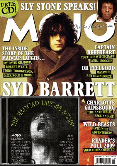
 The last magazine front page I will be analysing is Mojo Magazine made in March 2010.
This magazine cover is quite packed as it contains a large sell line across the page along with the six other cover lines along with a brief description for each of the items. The main image is a large picture of Syd Barrett across the page in-front of the mast head "Mojo". The magazine cover also contains other conventional aspects of a front cover such as a bar-code, a puff about a free CD with the magazine. The magazine has quite a yellow aged style tint to the background, this could suggest that the person in the image is very old or unfortunately dead.
The magazine is made by Mojo which is published by Bauer Media which is a large and quite powerful media company. The magazine has quite a simple and straight forward white logo.
The ideology of this magazine cover seems to me to be trying to get an idea across about the different bands and people who have been around in the past. With the colour of the images background however this background colour could also be considered as a gold colour suggesting that this generation of people where born in the golden age the pinnacle of the music industry however some people may argue otherwise.
The audience for this music magazine appears to be the older middle aged population as the music featured within this magazine is from around the 70's time period.
The cover represents Syd Barrett as a musical icon of the time period he was from. I think this is as he is located in the center of the image and front page being surrounded by the other magazines content suggesting that he is the main focus of the magazine just as a news paper has a headline and story for the front page, Syd is used for the front of this magazine and is the first thing which the readers and potential readers would look at.
This magazine cover addresses a audience of which people who recognise John Lennon as a former member of The Beetles. The population tends to be ageing from around 20 to 65 years old. As this is the generation who got to witness the band in full swing.
The magazine represents John Lennon as a idol and a great man who was a great musician.
This magazine cover is quite packed as it contains a large sell line across the page along with the six other cover lines along with a brief description for each of the items. The main image is a large picture of Syd Barrett across the page in-front of the mast head "Mojo". The magazine cover also contains other conventional aspects of a front cover such as a bar-code, a puff about a free CD with the magazine. The magazine has quite a yellow aged style tint to the background, this could suggest that the person in the image is very old or unfortunately dead.
The magazine is made by Mojo which is published by Bauer Media which is a large and quite powerful media company. The magazine has quite a simple and straight forward white logo.
The ideology of this magazine cover seems to me to be trying to get an idea across about the different bands and people who have been around in the past. With the colour of the images background however this background colour could also be considered as a gold colour suggesting that this generation of people where born in the golden age the pinnacle of the music industry however some people may argue otherwise.
The audience for this music magazine appears to be the older middle aged population as the music featured within this magazine is from around the 70's time period.
The cover represents Syd Barrett as a musical icon of the time period he was from. I think this is as he is located in the center of the image and front page being surrounded by the other magazines content suggesting that he is the main focus of the magazine just as a news paper has a headline and story for the front page, Syd is used for the front of this magazine and is the first thing which the readers and potential readers would look at.
No comments:
Post a Comment